Showing posts with label my own fonts. Show all posts

Tuesday, 16 August 2011

fonts (class, styles) for new academic journal

I am involved with starting a new academic economics and finance journal. Thus, the world is our oyster---we can choose whatever looks we want to choose. Since I have a role, LaTeX is going to be our typesetting system.

Now, I want my authors to be able to install the latest TexLive and be able to format the article themselves, although we will do this for many of them. This means that I do not want any fonts or other required inputs that are proprietary, and that require anything unusual. It should work out of the box.

For fonts, I need a full complement of math with the text. cmr is out. Even though it is now scalable, it just has acquired too much of a "texy working paper" look at this point. I am thinking mathptmx. I also like the idea of sticking to one font for headings and text, if only because this won't create a garish amateurish look, and I can see myself committing a faux pas if I had to mix fonts. TUG lucida is out, not because it requires a purchase, but because it requires an installation. Would the TeX Gyre fonts offer some good suitable alternative to mathptmx? Again, I need something fairly complete.

What is considered to be the most sane BiBTeX bst format? (we use harvard.sty in economics.)

Monday, 8 August 2011

Facing off with Fonts

This request from an author whose book I was coordinating a few years ago opened my eyes to the psychology of fonts. She wanted to send questionnaires to a bunch of people and, since she was far off in Russia, wanted me to do the sending.

“I find that this is a most readable font and people always reply when I send it in this font,” she explained.
That set me thinking about fonts and the visual persuasion strategy. Just as we respond better to some handwriting, is it true that we respond better to some fonts? Father Google said yes. 

And, just as handwriting can tell us a lot about the writer, can the computer fonts tell us anything about the person using them? 

Oh yes, said Father Google again, throwing an old study The psychology of Fonts, by Dr Aric Sigman, commissioned by Lexmark Printers, at me.


Wednesday, 3 August 2011

Windows Vista, 7 - Install New Fonts And Manage


Windows 7 has a wide range of fonts but they are still not enough for some users. Unfortunately, a command for installing more fonts is not available in the font folder at first glance.


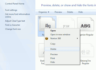
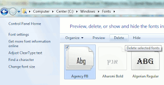
In order to configure fonts, click 'Appearance and Personalization' in the Control Panel and then 'Fonts'. In this view, every entry already has a mini preview of the relevant font.


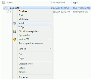
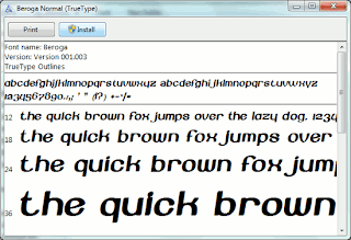
There are several options for installing new font types. It is usually enough to copy the new font file into the folder 'C:\Windows\Fonts'. The disadvantage of this method is that only the file name and not the font name is later displayed in applications. It is thus better to select one of the following procedures: Open the folder with the desired font file in Windows Explorer. Right click the file entry and select the context command 'Install'. Even the preview window of the font type which opens on double clicking has an 'Install' button. A click on it integrates the font into the system.


The other option is to open the Fonts folder and press [Alt]. Windows then displays the menu bar. Click 'New Font' in the 'File' menu, navigate to where the new font is saved and open the file. (Works in Windows Vista)

New Font Monarcha

Monarcha is a serifed type family with a baroque style influence. Its roman versions are slightly skewed and its italics have unusual calligraphic features. The contrast between thick and thin strokes is relatively smaller than in conventional serif fonts. These characteristics, coupled with its rounded shapes, give Monarcha a special fluidity and texture.

The family consists of 8 styles, 4 weights in Book, Regular, SemiBold and Bold, plus related italic versions. These OpenType format fonts have extended character sets to support Western European CE, Baltic and Turkish languages.


Saturday, 30 July 2011

Google Gets All Designy With Updated Homepage, Search Results And Free Fonts

Oh, so you thought Google was done after it rolled out Google+, Circles, Sparks, Huddle, and Hangouts? No, no, no. Google will be done when that’s Google-brand oxygen you’re breathing. This afternoon, the search giant’s rollout announcements have continued, as the official Google blog quietly declared (relatively speaking) that the Google Search page (and products across the Google empire) will be getting “a bit of a makeover” over the next few months. And there are new web fonts, too. OMGoogle!

Basically, these updates will focus on adding enhanced usability, cleaner design, and an improved UX to Google products. While these changes will roll out across all Google products, it looks like the focus will be on cleaning up Google Search, Maps, and Gmail. According to its blog, the intention behind this iterating is to succeed in “bringing forward the stuff that matters to you and getting all the other clutter out of the way”. But what does that mean? More specifically, Google will be adding bolder colors for actionable buttons, hiding those that aren’t essential until they’re actually needed, etc.
Google.com

And, as you can see below, the results page will also be getting a bit of a new look. Users will find a new gray bar and a blue search button to highlight the search box at the top of the page. Oh, and how about a black navbar?