Wednesday, 17 August 2011

Font Pain and Poetry: So Much Depends on a Curve

Font wonks fight. They champion some typefaces and sneer at others. They go ballistic if a system of signage is altered, as when Ikea changed its designated corporate font from Futura to Verdana in 2009. And they show off tribal symbols. A T-shirt that is depicted in Simon Garfield’s “Just My Type: A Book About Fonts” is adorned with nothing but the ornate ampersand of the font Caslon. This graphic, Mr. Garfield remarks, is capable of “occasionally eliciting a nod from another aficionado, like smug fans of a cool pop band before it becomes famous.”

Sometimes (as with Ikea’s typeface treachery) a tipping point will rock the world of fonts. “Just My Type” should be one of them. This is a smart, funny, accessible book that does for typography what Lynne Truss’s best-selling “Eats, Shoots & Leaves” did for punctuation: made it noticeable for people who had no idea they were interested in such things. Your friends’ eyes may glaze over when you begin to regale them with the font-related trivia with which this book is packed. (What is the Woody Allen movie credits font? Windsor.) If that should happen, recommend that they read Mr. Garfield too.

Tuesday, 16 August 2011

fonts (class, styles) for new academic journal

I am involved with starting a new academic economics and finance journal. Thus, the world is our oyster---we can choose whatever looks we want to choose. Since I have a role, LaTeX is going to be our typesetting system.

Now, I want my authors to be able to install the latest TexLive and be able to format the article themselves, although we will do this for many of them. This means that I do not want any fonts or other required inputs that are proprietary, and that require anything unusual. It should work out of the box.

For fonts, I need a full complement of math with the text. cmr is out. Even though it is now scalable, it just has acquired too much of a "texy working paper" look at this point. I am thinking mathptmx. I also like the idea of sticking to one font for headings and text, if only because this won't create a garish amateurish look, and I can see myself committing a faux pas if I had to mix fonts. TUG lucida is out, not because it requires a purchase, but because it requires an installation. Would the TeX Gyre fonts offer some good suitable alternative to mathptmx? Again, I need something fairly complete.

What is considered to be the most sane BiBTeX bst format? (we use harvard.sty in economics.)

Tuesday, 9 August 2011

AFP Consortium Announces New Version of AFP Architecture

The leading architecture for transaction printing has been updated to improve the operational efficiency of printing environments, while providing a higher level of interoperability among AFP products, including carry for the latest fonts, images and graphics. Most transaction documents and sensitive or critical communications associated with financial, insurance, sell, utilities and healthcare institutions worldwide use AFP amounting to tens of millions of mail pieces produced daily.

The new exchange set IS/3 are designed to provide the functionality required for today's complex production printing environments. Support for IS/3 will enable smoother addition across the elements of a printing system -- including formatters, servers, transforms, printers, AFP viewers and archive systems -- with less customization and faster time to manufacture with any given configuration. The enhanced interoperability of IS/3-compliant components will allow customers to significantly cut the price and time involved in configuring, installing and operating multi-vendor AFP systems.
+
IS/3 features inclusive color support, including process and spot colors, ICC-based color management, and industry-standard image file formats such as TIFF and JPEG. IS/3 also includes support for industry-standard OpenType fonts and Unicode-based data encodings.

"With this new version, we are cementing AFP's position as the standard presentation architecture for monochrome and color variable-data production printing," said Harry Lewis, chairman of the AFP grouping. "By improving interoperability of AFP solutions across vendors, we reassure customers that they can design their print environment using best-of-breed AFP components from multiple vendors with self-confidence that they will work together easily and efficiently."

Monday, 8 August 2011

Facing off with Fonts

This request from an author whose book I was coordinating a few years ago opened my eyes to the psychology of fonts. She wanted to send questionnaires to a bunch of people and, since she was far off in Russia, wanted me to do the sending.

“I find that this is a most readable font and people always reply when I send it in this font,” she explained.
That set me thinking about fonts and the visual persuasion strategy. Just as we respond better to some handwriting, is it true that we respond better to some fonts? Father Google said yes. 

And, just as handwriting can tell us a lot about the writer, can the computer fonts tell us anything about the person using them? 

Oh yes, said Father Google again, throwing an old study The psychology of Fonts, by Dr Aric Sigman, commissioned by Lexmark Printers, at me.


Wednesday, 3 August 2011

Windows Vista, 7 - Install New Fonts And Manage


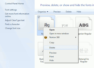
Windows 7 has a wide range of fonts but they are still not enough for some users. Unfortunately, a command for installing more fonts is not available in the font folder at first glance.


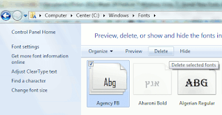
In order to configure fonts, click 'Appearance and Personalization' in the Control Panel and then 'Fonts'. In this view, every entry already has a mini preview of the relevant font.


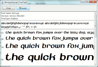
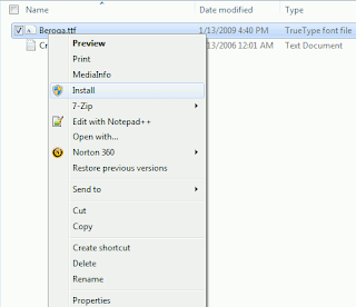
There are several options for installing new font types. It is usually enough to copy the new font file into the folder 'C:\Windows\Fonts'. The disadvantage of this method is that only the file name and not the font name is later displayed in applications. It is thus better to select one of the following procedures: Open the folder with the desired font file in Windows Explorer. Right click the file entry and select the context command 'Install'. Even the preview window of the font type which opens on double clicking has an 'Install' button. A click on it integrates the font into the system.


The other option is to open the Fonts folder and press [Alt]. Windows then displays the menu bar. Click 'New Font' in the 'File' menu, navigate to where the new font is saved and open the file. (Works in Windows Vista)

New Font Monarcha

Monarcha is a serifed type family with a baroque style influence. Its roman versions are slightly skewed and its italics have unusual calligraphic features. The contrast between thick and thin strokes is relatively smaller than in conventional serif fonts. These characteristics, coupled with its rounded shapes, give Monarcha a special fluidity and texture.

The family consists of 8 styles, 4 weights in Book, Regular, SemiBold and Bold, plus related italic versions. These OpenType format fonts have extended character sets to support Western European CE, Baltic and Turkish languages.


Monday, 1 August 2011

New Corporate & Broadcast Focus in ready2go Collection 4

Features:
  • Over 150 different projects, including alternate color looks, rotate camera motions and additional animated content, offer a wide variety of looks to handle most types of productions.
  • Complete customization with the ability to take projects apart, change colors and fonts, add your own elements, turn on and off layers or alter timing.
  • Fresh edit-friendly segments provided for most of the full length project templates make the task of customizing the projects even easier than before. Build your own version of the project by placing template segments on your timeline to generate your desired edit or extend the length of each part to up to 15 seconds.
  • 24 matching ready-to-use HD & SD animated Swipes give you the perfect tradition way to transition between project segments.
  • Includes 10 of the most commonly used size formats for HD and SD projects so no matter if you work in Full HD, 720P, PAL, or NTSC you have access to the right project for every condition.
  • Unlike projects from other sources, you receive ongoing and in-depth training through DJTV that shows you exactly how to use and customize the projects.
  • Handpicked Bitstream fonts that graphically "fit" with each template are included with the package. You can easily alternate with any font on your system.
  • Nothing is hidden or not possible to get at. You have entire access to the project just as the animator designed it. No matter what your skill stage you can learn something new by analyzing how the projects are set up before customizing them.
  • Developed using only the effects and features built into After Effects for seamless compatibility. No third-party plug-ins required.

Font Creator